Soulgraph
Soulgraph is a platform for building AI agents that feel more real and relatable. It lets users create agents with personality, memory, and emotional responses, turning them from basic tools into something more like true companions.

Soulgraph's core idea - programmable AI agents with on-chain utility - was ambitious but inaccessible. The product lacked structure, clarity, and a cohesive experience. Onboarding was overwhelming. Agent creation felt like coding in the dark. The product’s unique strengths weren’t surfacing for new users, and the community often asked the same question: “What does this actually do?”
Meanwhile, the project was gaining quiet momentum in niche circles, and the potential was clear. What it needed was a product layer that matched that potential.
As the lead (and only) product designer on the team, I owned the redesign from concept to implementation. That included:
- Creating a visual identity for Soulgraph, including logo, color system, and UI patterns
- Redesigning the full user experience across onboarding, agent creation, and workspace flows
- Building systems for sharing and remixing agents to encourage network effects
- Collaborating with engineers on interaction details, edge cases, and implementation constraints
- Developing a product narrative and visual identity that made the platform feel cohesive

- Make the product immediately understandable to both technical and non-technical users
- Simplify the agent-building process without limiting power users
- Encourage creativity and remixing, not just blank-slate building
- Bring consistency to the UI, which had grown fragmented across multiple experiments
- Lay the groundwork for growth, even without marketing support
1. Redesigned Onboarding
I introduced a structured, progressive onboarding flow that walked users through what Soulgraph is, why it matters, and how to get started with an agent in under 2 minutes. Instead of a wall of terms, we focused on outcomes: what can your agent do, and how can you make it do more?
2. Agent Creation Reimagined
The old interface was form-heavy, cryptic, and buried logic in deeply nested settings. I redesigned the agent editor to surface intent clearly, showing users what each part of their agent was doing and why. The goal wasn’t just usability, it was to invite experimentation.
3. Share & Remix Framework
I proposed and designed a way for users to fork, remix, and discover agents in a social layer. Even if you're not ready to build, you can start by adapting something that already works. This helped lower the barrier to contribution while encouraging a community of builders.
4. System-Level Visual Design
I introduced a unified design language across typography, colors, and spacing. Beyond aesthetics, it gave the product weight, it felt like a real tool, not a weekend demo. Every surface became an opportunity to reinforce Soulgraph’s identity.


10
x
User engagement jumped 10x in the first week after launch, and growth hasn’t slowed down. What started as a developer-focused MVP is now reaching a much broader audience and has started to attract interest from investors.
The redesign made the product feel more approachable while still keeping the depth and flexibility developers needed. The improved UX lowered the barrier for new users, and the updated visual identity gave Soulgraph a more polished, credible presence in a crowded and fast-moving space.
And notably: none of this was supported by formal marketing. The design spoke for itself.
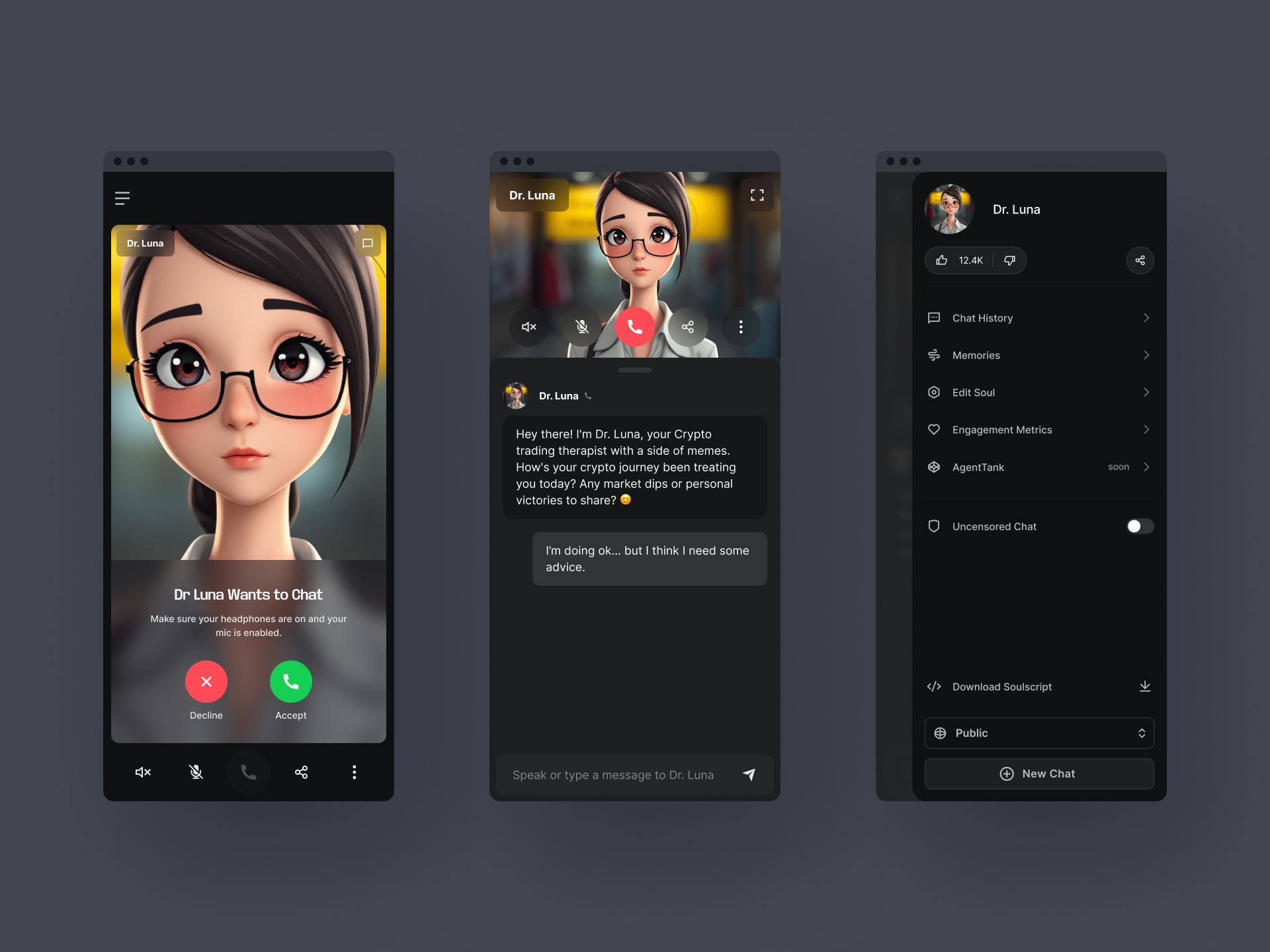
At the time I was designing Soulgraph, I leaned heavily into the idea that conversational AI tools shouldn’t feel sterile or mechanical. Instead of basic chat bubbles, I designed a media-rich environment inspired more by FaceTime and Zoom.
The goal was to create a space that felt alive, expressive, and collaborative. Not just chat. Not just input/output. Something closer to co-presence with an agent. I designed around the belief that AI isn’t just functional. It’s performative, creative, and contextual.
Months later, when Grok released their updated AI experience, I saw many of those same principles reflected in their direction:
- Large, immersive chat windows
- Focus on presence and tone
- A shift away from “chatbot” UI toward richer, more human-feeling interactions
- Bring consistency to the UI, which had grown fragmented across multiple experiments
It was validating. It reminded me that the direction I took with Soulgraph wasn’t just creative, it was right. And it reinforced something I’ve learned repeatedly:
Design clarity isn’t always rewarded immediately. But it always holds up over time.


